Multitouch von Microsoft

Microsoft Surface (Demovideo)

Bis gestern dachte ich, große Multitouchscreens seien von der Marktreife noch ein gutes Stück entfernt. Doch nun hat Microsoft auf der D5: All Things Digital eine Art Multitouch-Tisch („Microsoft Surface“) vorgestellt.

Die Maschinen sollen noch in diesem Jahr käuflich zu haben sein, preislich allerdings etwa um den Faktor 10 teurer als herkömmliche Rechner. Larry Larsen zeigt ein zehnminütiges Demovideo. Heise tickert eine Zusammenfassung der Pressemitteilung von Microsoft.

Doch am besten zeigt dieser Vierminüter von PopularMechanics, was in Microsofts neuem Tisch steckt:

Robert ist schon ziemlich aufgeregt.

Umwerfend

In Monterey hat gestern die TED2007 begonnen. Bruno Guissani liefert wieder exzellentes Liveblogging für alle, die nicht dabei sein können. (TED2008 ist übrigens auch schon ausverkauft.)

Jeff Han, regelmäßige Leser mögen sich an ihn erinnern, ist nach 2006 (siehe Video oben) nun zum zweiten Mal auf der TED. Diesmal zeigt er seine interaction wall (siehe Foto unten), ein noch größerer Multitouchscreen mit noch mehr Möglichkeiten. Giussani berichtet:

It’s an amazing thing: enlarging a picture requires only touching it with two fingers and moving them apart — with the file following their movements and spreading on the screen. There is basically no structured interface to his device: they just “ navigates“ in the information, zooming in and out of maps or tilting them or adding graphic elements or redistributing images on the screen just by moving their fingers on them.  They add layers of images — a map on top of a map, for example, where the one on top acts as a „lens“. They have built in dozens of applications, and functionalities that make it even more effective: drawing a circle for example initiates a menu, etc.

Jeff Han und Phil Davidson zeigen die interaction wall (Bild: Bruno Giussani)

Und klar, Giussani bringt auch die Usability-ProblemeHerausforderungen zur Sprache, die neulich schon auf dem Fischmarkt Thema waren (siehe dort in den Kommentaren):

„The most interesting thing is that when people first use this, they tend to go with one finger, then retract it: we basically have to un-teach people what they have learned so far about computing, and convince them that they can use several fingers, that several people can work on the screen at once, that you can actually use a random number of touchpoints, etc“. The Apple iPhone, when it comes out, may help: it will also come with a multitouch screen, although it’s so small that it won’t make for a very interesting multitouch device (Jeff’s „wall“ is 8 feet wide). This is a mindboggling breakthrough technology.

The OTTO Store Experience

Der OTTO Store hat auch international einige Aufmerksamkeit bekommen. So schreibt Impersonation Failure:

A showcase of what’s possible today using .NET 3.0 is the new OTTO Store that went live earlier this month. […] Despite the slick WPF user experience the site is also one of the first to utilize managed Infocards to support the provisioning experience. Otto customers can associate their account with a Otto managed card backed with the self issued card of their choice.

Screen aus dem OTTO Store: Bestellen im CardSpace
Mehr zu den Details der Cardspace Experience hat Vittorio Bertocci.
Tim Sneath („Musings of a Windows Vista Technical Evangelist“) schreibt über die virtuelle Umkleidekabine „Mix & Match“:

What makes this application really stand out from anything you could easily do on the web is that if you like a couple of products but want to see how they go together, you can drag them to a „mix and match“ icon on the bottom of the screen, and then you can dress a model with the items and see whether they go together in ensemble. I think even my daughter is going to enjoy this – it’s the online equivalent of „dress up Barbie“, even if that’s not quite what they intended.

Microsoft-Ingenieur Nigel Parker hat eine interessante Interpretation der strategischen Bedeutung des Projekts:

If you’ve read ‚the long tail‘ you’ll realise what Otto are doing here. They are using a smarter UI to make their catalog more accessible to their customers so that they can sell their products further down the tail thus creating a competitive advantage in a world where shelf space isn’t limited and your preferences can be visually served up front and centre.

Es geht nicht um Technik

„Ist das die Zukunft des Shoppings?“ Fragt Markus Breuer angesichts des OTTO Stores und trägt ein wichtiges Argument vor:

Was mich an der Zukunftsfähigkeit dieses Projekts zweifeln lässt, ist wirklich nicht der Neid. 🙂 Es ist die Tatsache, dass es sich um einen Online-Shop handelt,

  • der nur auf PCs mit Microsoft Vista (unter Aero) läuft
  • den ich downloaden muss, bevor ich ihn nutzen kann

Ich muss ganz ehrlich sagen, dass ich das für einen Rückschritt halte. Auch wenn Microsoft Vista in 2 – 4 Jahren vermutlich das meistverwendete Betriebssystem sein mag, ist es für Endanwender sicherlich nicht wirklich angenehm, für jeden Shop eine separate Applikation herunterladen zu müssen.

So ist es. Die Zukunft des Onlineshoppings sind nicht unbedingt proprietäre Clients, die nur auf einer einzigen Plattform laufen. Das erwartet vermutlich nicht einmal Microsoft.

Der OTTO Store zeigt, soviel ist richtig, die Möglichkeiten von Windows Vista. Das hat auch seine Berechtigung und ist das Anliegen von Microsoft. Aber viel spannender sind die neuen Möglichkeiten für einen kataloggetriebenen Versender wie OTTO.

Homevideo von shoppingzweinull.de

Es geht um Bedarfsweckung, Erlebnis und Entertainment (um mal Dr. Thomas Schnieders zu zitieren, Direktor Neue Medien bei OTTO). Es geht um neue Formen der Warenpräsentation und um Emotion. Und es geht um eine intelligente Verbindung von Katalog- und Onlinegeschäft.

Denn die Diktatur des besten Preises, unter der große Teile des E-Commerce-Geschäfts ächzen, gilt ja im Bereich Mode allenfalls teilweise – nämlich dort, wo Vergleichbarkeit herrscht. Geht es aber um die passende Hose zur Bluse, dann können guenstiger.de und Ebay nicht helfen.

Was die Technik angeht, so stehen wir hier vor dem klassischen Henne-Ei-Szenario. Second Life, um mal ein Lieblingsthema von Markus Breuer herauszugreifen, braucht auch einen (anfangs mehr, mittlerweile weniger proprietären) Client.

Ich hoffe, dass da ein noch paar Ideen mehr entwickelt werden und „Shopping“ im Internet auf Dauer mehr sein wird, als nur in einem Katalog zu blättern. Im Kern des „Shopping-Vergnügens“ in der physischen Realität stehen ja kollaborative, soziale Ansätze und die räumliche Nähe und inhaltliche Diversität vieler verschiedener Anbieter.

So ist es. Warten wir es ab. Ideen sind hier nicht die knappste Ressource. Soviel steht fest.

The Future of Shopping?

Today, Windows Vista appeared in, according to Bill, 39,000 stores. Quite possibly a big deal for many people who spend as much time in front of a computer as I do, but not for me, at least not when compared to the launch of the OTTO Store.

OTTO, for readers outside of Europe, is the no. 1 worldwide retailer in mail-order sales, and no. 2 behind Amazon in online sales. Maybe hard to believe, considering almost noone knows their name outside of Europe, but apparently it’s a fact. Americans have, however, certainly heard of Crate & Barrel, which is one of around 20 companies which belong to the the OTTO Group.

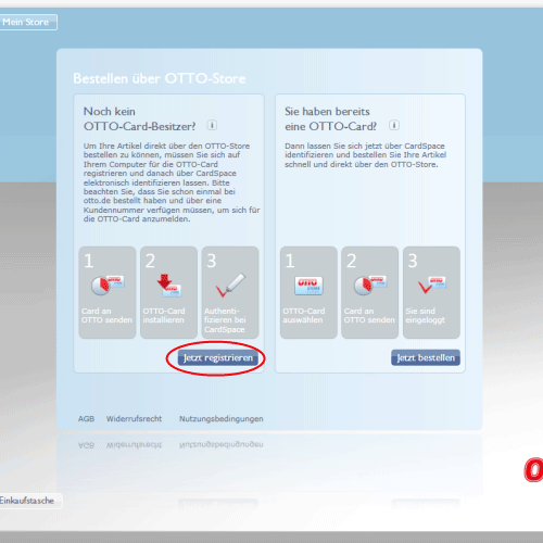
SinnerSchrader Studios, where I work, was lucky enough to be approached by OTTO and Microsoft, to develop a shopping application for OTTO which would run in Windows Vista. This became a challenging and exciting project for us which started last summer and culminated in the launch today. As of a few hours ago, you can download and install the OTTO Store (if you’ve already installed Vista, and have a good understanding of German).

OTTO Store

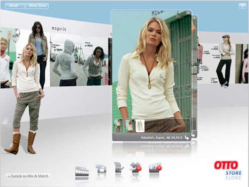
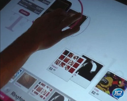
I’ve been designing stuff for the web since 1993. After working for so long in one medium (which to be honest hasn’t changed that much since then) it was a shock and in a way a relief to work on an app for Vista. It reminds me of the good old days of CD-Roms, when you could animate your heart out, throw in videos all over the place, and even spin things around in 3D if you wanted to. With Vista, and today’s growing bandwidth, that’s all possible again. It’s like a whole new world, and requires a whole new way of thinking. No more boxy layouts designed to make content management systems happy, no more pseudo piece of paper layouts, and no more browser. The OTTO Store is a self-contained application which is installed on the user’s machine. The fact that it’s a “download once, use many” experience gave us the freedom to think up stuff for which a user would never wait for his browser to show him.

As for the development process, “challenging” is a polite word for it. Since this was a joint project between us, OTTO and Microsoft, we had access to their development software (once known as Sparkle, now known as Blend, either way also known by the imminently forgettable name “Microsoft Expression Interactive Designer”) in the alpha and beta phases. This was obviously a blessing and a curse. Web designers are used to fully functional, stable programs like Adobe Photoshop. The security of knowing you can work all day and save when you go home is a feeling I learned to miss. On the other hand we spent a week in Redmond, got to give our feedback directly to Microsoftians, and were pleased to see most of our problems solved in successive versions.

The relief and pleasure of having the OTTO Store finished and online is noticeable throughout our whole team — all of whom I must add worked far more and harder on the Store than I did — but a big question mark remains in my head. Is this really the future of shopping? Noone can answer that question yet, but I’m very interested to see how many people download it, and of those, how many actually buy something. I’m honestly pleasantly surprised that a company as large and old as OTTO had the guts and vision to invest in something so innovative which may, at first, bring so little concrete return.

I’ve also got to say I’m proud and excited to be a member of one of very few teams who can realise such a project today in Germany. It’s been a long time since I’ve seen anything this new, worked in such a close-knit team, and learned so much at work.

More about the OTTO Store

Originally published at mattbalara.com.

Wie sinnvoll sind Tag-Clouds?

Ich stoße immer häufiger auf Tag-Clouds, die weniger hilfreich sind, sondern im Gegenteil erst so richtig die dahinterliegende Beliebigkeit offen zur Schau tragen. Auch bei der hier oben im Fischmarkt sind mir persönlich viel zu viele Redundanzen und Leerworte.
Hier mal das Beispiel von Blog.de
blog_tags.gif
Machen Tag-Clouds wirklich Sinn? Wo funktionieren sie?

Frosta Generated Content

konsequent.png

Frosta testet weitere Möglichkeiten des vernetzten Kundendialogs in Echtzeit aus. Nach dem Frostablog – nach wie vor eine relevante Referenz für Unternehmensblogs im deutschsprachigen Raum – kommt jetzt Video an die Reihe. Kein Videocast, sondern eine – ja, sprechen wir es ruhig aus – virale Plattform, die den Kern der Marke Frosta hervorhebt, die Konsequenz des Frosta-Reinheitsgebots.

Konsequenterweise heißt die Adresse konsequent.de. Fünf Menschen, darunter Frosta-Werksleiter Bernd, erzählen in fünf Videos aus ihrem Leben. (Nebenbei: Gibt es die Videos eigentlich auch bei YouTube, MyVideo & Co.? Die Videos gibt es auch bei YouTube.)

Das Design (es stammt wie die Idee selbst von Dorten) ist witzig, aber nicht besonders webbig, was sich spätestens an der etwas lieblosen Einbindung von Elementen wie Forum oder Spreadshirt-Shop zeigt. Popups sind nun wirklich nicht mehr Stand der Technik, und auch die T-Shirt-Motive rocken nicht.

Mehr zum Hintergrund bei Björn Ognibeni und natürlich im Frostablog.

Schlangenlinienfahren

Spiegel Online
Wenn Deutschlands wichtigste Nachrichten-Site ihr Erscheinungsbild erneuert, nach Spiegel-eigener Zählung zum sechsten Mal seit 1994, dann ist das schon eine kleine Notiz wert. Und entsprechend rauscht es im Bloggerwald. Doch auch dieses Rauschen bereitet Spiegel Online gleich selbst für seine Leser auf.
Bemerkenswert ist die Rezension bei netzausfall, die zunächst höchstes Lob zollt („Gereifte Schönheit“), aber dann die Fehler im Detail bemängelt:

Links wird die Hauptnews angeteasert, mit mehr Text als bisher, ich bezweifele, dass das jemand lesen wird. Rechts folgen die weiteren Meldungen in einfacher Linkform, sie standen bisher unter dem Hauptteaser. Dieser Aufbau hat zur Folge, dass das Auge nun Schlangenlinien fährt. Links zum Teaser, dort ein Stück runter, um den Namen des Autors zu lesen, dann das Stück wieder hoch und nach rechts, um die Links zu scannen, dann wieder runter in die nächste Content-Box, um dort (wieder links) die Überschrift des Hauptteasers zu lesen. Und so weiter.

Aber das ist noch nicht alles:

Auf den ersten Blick präsentiert Spiegel Online weniger Links pro Content-Box: einen Hauptteaser plus drei Links. Erst wenn man auf den winzigen Link “Blättern” klickt, erscheinen zwei weitere Links. Das ist wie Schlangenlinienfahren mit zusätzlichem Touchieren der Leitplanke. Entweder werde ich mich in Zukunft mit weniger Links zufrieden geben und somit den einen oder anderen Artikel verpassen, oder ich werde mehr Zeit brauchen. Beides sollte nicht im Interesse von Spiegel Online sein.

Christiane Link schaut auf dem Behindertenparkplatz nach der Barrierefreiheit – mit eher gemischtem Ergebnis. Mit Webstandards, bemängelt medienrauschen, hat man es an der Brandstwiete nicht so.

HTML 4.0, Tabellen und massenweise Fehler im Quelltext interessieren zwar nur Nerds, sind aber irgendwie auch so 1999.

* Wer gehofft hätte, mit dem neuen Gesicht und Anspruch wird Spiegel endlich auch seine angebotenen RSS-Feeds etwas aufbohren: Pech gehabt! Spiegel versäumt es leider Verständnis für RSS-Nutzer aufzubringen und so bleiben die RSS-Feeds wie seither: Für wahre RSS-Nutzer leider unbrauchbar.

Dem ist nichts hinzuzufügen.