 Mit zahlreichen Awards wurde Elke Maasdorff in den letzten Jahren für ihre Arbeit geehrt, unter anderem bei den New York Festivals, dem ADC und den Cannes Cyber Lions. Seit dem 1. November ist Elke Maasdorff Creative Director bei SinnerSchrader. Bis 2007 arbeitete sie bei Elephant Seven als Senior Art Director und betreute dort große Kunden wie Montblanc, Audi, Rösle, Telekom und Allianz.
Mehr zu der Personalie in der Pressemitteilung.
Design
Es gibt 88 Beiträge in Design.
Clay Shirky und die 4 1/2 Daueraufgaben für Social Media
Clay Shirky hat nach seiner gestrigen Konversation mit Charles Leadbeater seine Keynote weggeworfen und aus den Trümmern eine neue gebaut. Oder jedenfalls sagt er das. Nach der Rede von Genevieve Bell über Secrets and Lies müssen da Zweifel erlaubt sein.
Doch einem Weltklasseredner wie Shirky traue ich durchaus zu, dass er sich fix auf sein Auditorium einstellen kann. Auf der PICNIC präsentierte er heute viereinhalb Herausforderungen, die jeder kennen sollte, der sich mit Social Media befasst.
(1) Designprobleme sind soziale Probleme
In grauer Vorzeit des Web 1.0 mag es so gewesen sein, dass (zumindest gedanklich) die Community zuerst da war und dann begann, mit Hilfe von Software etwas zu teilen: Gedanken, Fotos, Videos – was auch immer. Heute ist es umgekehrt. Im Zeitalter des Web 2.0 kann jede URL ihre eigene Community werden.
Shirky illustriert diese These am Beispiel von flickr. Dort kann es passieren, dass aus der Diskussion um ein einziges Bild ein ganzes Tutorium über ein fotografisches Spezialgebiet wächst. Dort bilden Freunde der Schwarzweißfotografie eine Gruppe, die sich strenge Regeln gegeben hat: Jeder, der dort ein Foto publiziert, muss sofort die beiden Fotos davor kommentieren.
Nicht flickr ist die Community, sondern die Freunde der Schwarzweißfotografie auf Twitter. Und sie geben sich ihre Regeln selbst, kontrollieren die Einhaltung und entwickeln die Regeln weiter. Softwaredesign kann da wenig beitragen – außer nicht im Wege zu stehen. Was gar nicht so wenig ist.
(2) Weniger Features sind mehr
Social Software ist die einzige Softwarekategorie, in der spätere Produkte weniger Features haben als frühere. Mit einem simplen Tool wie Blogger wird heute mehr im Web publiziert als mit den hochgezüchteten Contentmanagementsystemen dieser Welt. Twitter hatte beim Start zwei Features, heute sind es sechs.
Bronze Beta ist eine von Fans der TV-Serie Buffy selbst getragene Website, die praktisch gar keine Features hat – aber dafür einen umfangreichen Satz an Regeln.
(3) Es gibt nicht den Nutzer
In Social Media gibt es eine Normalverteilung mit wenigen, sehr aktiven und vielen, wenig aktiven Nutzern. Die Grafik sieht aus wie der berühmte Long Tail. Und die beiden Nutzergruppen unterscheiden sich erheblich.
In der Wikipedia sind mittlerweile Schutzmechanismen eingebaut, mit denen sich die wenigen Aktiven gegen häufig wiederkehrenden Missbrauch der vielen Eintagsfliegen wehren können. Mehr und mehr Artikel können nicht mehr von jedem dahergelaufenen Vandalen bearbeitet werden. Es ist die gute, alte 80/20-Regel, die hier wieder einmal gilt.
Wie überhaupt in die Wikipedia mit der Realität, die sie abbilden soll, auch die Konflikte dieser Realität einwandern: Der Artikel über Pluto hat einen enormen Überarbeitungsschub erlebt, nachdem Pluto aus der Liste der Planeten gestrichen wurde. Und bei Galileo Galilei wurde ein bald 500-jähriger flame war ausgetragen, der mit der katholischen Kirche zu tun hat.
(3.5) Auch Designprobleme werden global
Der Künstler Aaron Koblin hat den Mechanical Turk von Amazon dafür verwendet, eine 100-Dollar-Note in zehntausend Elementen für jeweils einen Cent kopieren zu lassen. Das Internet macht es möglich, auf globaler Ebene zusammenzuarbeiten. Damit gibt es auch Designprobleme von nie gekannter Größe.
You could say that Aaron had 10,000 people working for him as in a way he did – he only payed them a penny – but they were working to collaborate with him and each other. If this were a real company then that would put him high up the list of employers with a large staff. The largest groups in the world that are working collaboratively are working like this.
What we are seeing now is spontaneous conditions of labour springing up. The Division of labour is spontaneous and there is a spontaneous division of motivation. No-one who runs a large company with a management structure cannot understand this. [aufgezeichnet von Lucy Hooberman]
(4) Veröffentlichen, um zu handeln
Die britische Bank HSBC holte sich eine blutige Nase, als sie Studenten erst zinsfreie Überziehungskredite anbot und dieses Angebot einige Zeit später zurückzog. Die Studenten fühlten sich betrogen und nutzten Facebook, um Druck zu machen. Die Bank musste einlenken.
Beispiele dieser Art gibt es zuhauf, aber immer dreht es sich darum, irgendetwas zu stoppen. Wie sieht es mit gemeinschaftlichem, kreativen Handeln aus, wenn es nicht darum geht, irgendetwas zu verhindern? Handeln ist der schwierigste Teil der globalen Zusammenarbeit. Das leuchtet jedem ein, der Getting Things Done gelesen oder schon einmal einen G8-Gipfel genauer angesehen hat.
Saftige Wand im Kickerraum
Was Spreadshirt für T-Shirts ist, will Juicywalls für Wände werden. Das hessische Start-up produziert individuelle Tapeten und Leinwände.

Bei SinnerSchrader hängt seit geraumer Zeit eine von Juicywalls produzierte Tapete im Kickerraum. Wer genau hinsieht und sich auskennt, der erkennt das Millerntor-Stadion. Nur erahnen lässt sich, dass die schwarzen Kickerfiguren den Totenkopf von St. Pauli auf dem Trikot tragen.
Was Juicywalls kann und wie das Start-up entstanden ist, hat Gründer Mark Hussain im Mai auf der next08 erklärt. Wer lieber liest, dem sei ein ausführliches Interview mit förderland ans Herz gelegt.
Geht der Trend zum Vollbildmodus?
In den letzten Tagen sind mir gleich zwei Websites (und eine halbe) über den Weg gelaufen, die im Vollbildmodus spielen. Für IKEA wartet Nils auf September und mithin auf den neuen IKEA-Katalog. Nebenbei – kam der nicht früher schon im August?
In der Fußzeile gibt es einen kleinen Umschalter für den Vollbildmodus. Die Agentur ist laut off the record übrigens Nordpol, Hamburg.
Sofort im Vollbildmodus startet, sofern der Browser sie lässt, die neue Website von Closed.
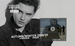
Auch funktioniert die Umschaltung zwischen Vollbild und Normalmodus sauber. Für eine Modewebsite ist Vollbild eine gute Sache.
Especially when it comes to fashion brands, to be able to exploit the whole screen, without the functional but ugly browser buttons, allows you to establish a cleaner, more immersive, visual relationship with the user.
I really like the Closed website (and even their collections), because it’s aesthetically fascinating, easy to navigate and, last but not least, it integrates well the e-commerce part into the virtual look book.
Die Website stammt laut Quelltext von unseren Ottenser Nachbarn Superreal, deren eigene Website momentan auch sehr schön mit Vollbild spielt.
Haben wir es da mit einem neuen Trend zu tun? Fallen Ihnen gar weitere Beispiele ein? Dann lassen Sie es uns bitte wissen.
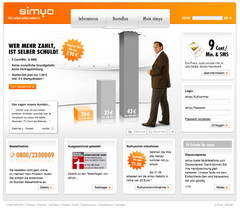
Original und Fälschung
Manches Original ist offensichtlich so gut, dass es Plagiate geradezu magisch anzieht. Unseren Kunden simyo hat es nun schon zum (mindestens) zweiten Mal getroffen. Doch sehen Sie selbst.
Original
Fälschung
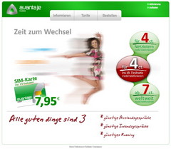
Ein paar Unterschiede sind durchaus zu erkennen, avantaje ist keine 1:1-Kopie und geht auch nicht so weit wie eine andere Copycat, die sich seinerzeit gleich beim Quellcode bedient hatte…
The Walled Garden Awards
 Dear Cannes Cyber Lions,
I’m writing just to say hi. I’ve looked at, and occasionally up to you for the seven years I’ve been working in an agency, but I’m leaving the agency microcosm soon and wanted to give you some advice before I go. It’s, um, kind of difficult to say, but, well, we’ve known each other for a while, and good friends tell each other the truth, right? So. Here goes.
I believe you’ve misunderstood the internet.
There, I said it. I know this has got to be embarrassing for you, being an internet awards thingie and all. I guess you didn’t get the memo. Although the truth hurts, I’m sure you’ll come out the other side a happier, shinier Cyber Lion.

Why do you force me to register to see the winners? It can’t be purely so that „the IAF, our official awards partners and relevant Emap Communications brands“ can throw a few more nuggets on top of my already overflowing spam folder, can it? That’s not what that extremely creatively worded bit on the rego form meant, is it? And, um, describe my job role? Give you my address? My phone number? Twenty-one mandatory fields? You’ve built a walled garden with high, thick walls, and want a DNA sample before you let me inside? For what exactly? You’re throwing press releases over the wall anyway, so what’s in it for me?
I’m afraid your site’s also doing your clients a disservice, and if they aren’t pissed yet, they sure as hell should be. What? You don’t have clients? Well, who are the agencies who send you submissions (and money) every year? And what if they realised that you’re using the medium for which they win awards (that’s the internet) in such a way that it reduces the chance of people hearing about their good work? If I was them, I’d be pretty pissed.
But, considering the way so many of your clients still use the internet–beautifully designed and animated, closed, unmashable ads that equal little more than click-a-minute-television–I’m honestly not surprised that you’re doing little better. My recommendation, and hope, is that you’ll one day see your role as a leading internet marketing awards thingie as a possibility to espouse and spread the spirit of the web and the methods that actually work. Openness. Transparency. Sharing. Participation.
You see, and it embarrasses me to have to explain this to you, but the internet is all about linking. Copy & paste is today’s marketing. Letting your fans mash your stuff up leads to success. Connecting little bits all over the place is what we do here outside the wall, and how people hear about new stuff. If your stuff’s good, some guy will carry it over the wall anyway, even if he does have to fill your form with bullshit to do it (yes, I’m sorry, but we do lie to marketers). And there’s a nasty chance that guy will own your Google juice, too. Making it easier by not building a wall in the first place just improves your chances of being loved. Have you heard that there’s a 14 year old on YouTube with 45 million views? He certainly didn’t do that with a registration form. How many registered users have you got? And how many registered as „Dr. Mickey Mouse“ like I did?
That’s it for now. I hope you take some time to think about this, and it makes you a bigger, better lion.
Yours sincerely,
Matt Balara
P.S.: I didn’t want to say it, but what the hell’s up with your logo? Dude, are you sure you want to wear that in public?
So congratulations to all the well-hidden winners of the Cannes Cyber Lions 2008! For those you you outside the wall who couldn’t be bothered registering, Dr. Mickey Mouse has sacrificed his 100% fake DNA for you. Here are all the winners in a PDF (unfortunately completely devoid of URLs), and here are the links:
Grand Prix
- UNIQLOCK for UNIQLO by PROJECTOR
- Sol Comments for SCANDINAVIA ONLINE by MEDIAFRONT
- Year Zero for TRENT REZNOR/NIN by 42 ENTERTAINMENT
Gold
- Absolut Machines for V&S ABSOLUT SPIRITS by GREAT WORKS
- Minimalism for MINI CANADA by TAXI 2
- Axe Laser for UNILEVER JAPAN by BASCULE
- AAA Town for AAA INSURANCE by PUBLICIS & HAL RINEY
- Non-Stop Fernando for EMIRATES AIRLINES by LEAN MEAN FIGHTING MACHINE
- Voyeur for HBO by BBDO
- UNIQLOCK (again?) for UNIQLO by PROJECTOR
- Rec You for SONY MARKETING by GT
- Loop, Plinth & Smile for MINI by GLUE
- Don’t Give Up for APPLE by TBWA\MEDIA ARTS LAB
- Balloons, Chicken & Spoons for VIRGIN GAMES by LEAN MEAN FIGHTING MACHINE
- A Blind Call for BRAILLELIGA
FOUNDATION FOR THE BLIND by DUVAL GUILLAUME - Pet Shops Boys – Integral for EMI MUSIC by THE RUMPUS ROOM
- Whopper Freakout for BURGER KING by CRISPIN PORTER + BOGUSKY
Silver
- Who the #I%$ is Fermin? for UNILEVER by GRUPO W
- Made of Japan for ASICS by WOEDEND!
- Nike Sparq for NIKE by R/GA
- Halo 3 Believe for XBOX by AKQA
- You Need a Quiet Space for IKEA by FORSMAN & BODENFORS
- BFD Builder for DOMINOS by CRISPIN PORTER + BOGUSKY
- See Something. Feel Something. for FOXTEL by SOAP CREATIVE
- Gringo’s First Words in… for GRINGO by GRINGO
- Orange Unlimited for ORANGE by POKE
- Hearing Test for NORWEGIAN RED CROSS by TRY ADVERTISING AGENCY
- Do You Have What it Takes? for SWEDISH ARMED FORCES by DDB STOCKHOLM
- Coke Zero Game for COCA-COLA GERMANY by NORTH KINGDOM
- Get Out and Play for NOKIA by FARFAR
- Year Zero (again for TRENT REZNOR/NIN by 42 ENTERTAINMENT
- Zoom In/Out for HONDA MOTOR CO. by DENTSU
- Mumbai & UK for EMIRATES AIRLINE by LEAN MEAN FIGHTING MACHINE
- Laws for EDITORA GLOBO by JWT BRASIL
- Relief for JAPAN ADVERTISING COUNCIL by DENTSU
- Do You Have What it Takes? for SWEDISH ARMED FORCES by DDB STOCKHOLM
- F**k Off for BARNARDO’S by BBH
- iPint for COORS BREWERS by BEATTIE McGUINNESS BUNGAY
- Internet Shut Down for MAOR by Y&R INTERACTIVE
- Eliminate for ACTION AGAINST HUNGER by SHACKLETON
- How We Met for SAMSUNG ELECTRONICS by THE VIRAL FACTORY
- Balloons for FORD MOTOR COMPANY NEW ZEALAND by JWT NEW ZEALAND
- The Key to Reserva for FREIXENET by JWT SPAIN
- Cezanne for ART POSTER GALLERY by PUBLICIS
There are a hell of a lot of bronze winners, and my copy & paste finger’s getting tired, so if you’re interested in the Cannes Cyber Lions bronze winners, check out the PDF and you know what to do.
Originally published at mattbalara.com.
compact. fundiert. ausgezeichnet.
![]()
Der BCP Best of Corporate Publishing verlieh in diesem Jahr zum zweiten Mal einen Preis in der Kategorie Electronic Publishing Newsletter. compact, der Newsletter der comdirect, kann erneut in dieser Kategorie glänzen und gewinnt Gold. Eine ausgezeichnete Steigerung im Vergleich zum Vorjahr.
SinnerSchrader ist für das Design von compact verantwortlich. Der Newsletter wird redaktionell von G+J Corporate Media betreut. comdirect ist ein Kunde von SinnerSchrader, und wir freuen uns über die erneute Anerkennung.
![]()
Top-Down Boxes or Bottom-Up Piles?

A chat with Ryan Singer after the next08 has been bouncing around in my head for a few days. We got onto some basic info architecture assumptions which define almost all sites my company makes, and most sites in the web. The more we explored the idea, the more both of us were surprised at how these assumptions often keep users from doing what they’re used to doing in the web — finding things fast.
Top-Down Boxes in Boxes
A new site structure usually starts with a number of assumptions. Big Fat Assumption Number One is that the content chunks will be stuffed into a hierarchy of boxes. The first group of boxes form the 1st level navigation, and each of those boxes usually has more boxes inside it. Often the 2nd level boxes have more boxes inside them, and I’ve seen this boxes in boxes structure repeated down to the 5th level.
A user can only try to guess which box what he’s looking for might be in. And instead of getting the content chunk he’s looking for when he selects a box, he gets a new set of boxes and starts guessing again. When he finally reaches real content (after guessing, guessing, guessing, etc.) the chances are relatively good that he’s not found what he wants, and the guessing game can start from the top again.

If individual chunks of content (or user goals) are the bottom of our structure, we’ve just built an info architecture from the top down.
Hierarchical boxes are also made of „conceptual steel“ and separate chunks from each other. This works for a book: the boxes are chapters, which have boxes in them called paragraphs, which are full of chunks called sentences. But once a book’s printed it doesn’t change. Web sites change constantly, and boxes are change-resistant.
Bottom Up Piles & Lenses
Instead of imposing a structure on content chunks from the top down, why not look at the chunks themselves first; i.e. bottom up? If we find common attributes for the chunks, e.g. colour, and label each chunk either blue, green, yellow or red, then we have a labeled pile of chunks.
To find something in a colour labeled pile, users could use „lenses“. A red lens would make all blue, green and yellow chunks disappear, leaving only the red chunks visible. If our chunks also had an attribute size–with labels big, medium and small–they could then combine size and colour lenses to quickly find large/red chunks, or small/green ones.

Old Hat?
Sure, none of this is particularly revolutionary–it’s the way a great deal of those sites we insist on calling „web 2.0“ work. Flickr is a gigantic pile of images whose labels are tags, but also technical details such as which camera made the image, Creative Commons license, interestingness, etc. Most of Flickr’s navigation doesn’t throw the user into a box, it provides them with a lens through which they can look at the chunks they’re interested in, and ignore the rest of the pile.
Where The Hell am I? Who cares?
The assumption that drives us to make top-down box architectures is that without a structured, categorised series of boxes in boxes, the poor user will lose his orientation. I think this is seriously outdated thinking, which comes out of the interface thoughts of the pre-internet software design era. It might make sense in the focused, daily-use context of an application, but a user who can find any page in your site from google, and jump directly to it, doesn’t give a crap where he is as long as he finds what he wants. When I’ve asked a number of daily-use but less than cutting-edge users „where“ in the web they are right now, the answer surprised me: „What do you mean? I’m in Google.“ So much for that carefully thought out color-coded box hierarchy.
Hunters & Gatherers
Am I recommending that all of my corporate clients throw their hierarchies out the window? Hell no. But I would like to see them experiment a little more with piles & lenses to supplement their box hierarchies. Traditional boxes-in-boxes navigation is fine for gatherers, but google is teaching users hunter strategies: select a goal, focus on it, jump on it as quickly as possible. The next time you start a concept with Big Fat Assumption Number One, and begin stuffing content into boxes-in-boxes, take a step back, look at the chunks at the bottom, and see if you can offer the hunters piles and lenses to speed their hunt.
Originally published at mattbalara.com
Amazon testet neue Navigation
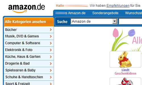
Seit einigen Tagen testet Amazon auch in Deutschland die bei Amazon.com schon im vergangenen Jahr schrittweise eingeführte neue Navigation. Zeit dafür wurde es, da die alte Karteireiternavigation angesichts der Vielzahl inzwischen reichlich unübersichtlich geworden war.
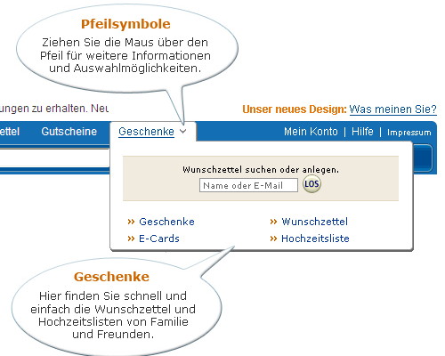
Mehr Screenshots bei shoppingzweinull.de und bei Thorsten Boersma.
Shameless
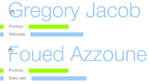
While standing outside having a smoke this morning, colleague Gregory Jacob brought me back to the subject of web design “theft”, which I wrote a couple articles about in 2006. Back then, the discussion showed that there are many varying opinions of where inspiration stops and theft starts. Greg’s example, which absolutely takes the cake in my experience, is without question way over the border.
Greg’s a Flash guy, with a pleasingly minimal personal site. He received a mail from a friend this morning, with a link to a stunningly similar site. Have a look:
- Greg’s site, DoublePlus++
- Foued Azzone’s personal portfolio (update: Foued’s gone offline, but you can still compare on Flickr)
After a little research it was clear that Foued, due to laziness, deficient creativity or most likely a combination of both, had simply downloaded Greg’s SWF and the XML which defines the site’s content, and after a little text editing, uploaded both on his site.
It Gets Better
Not only did he shamelessly rip off Greg’s work, but he then submitted his rip-off to numerous awards sites, and won on four of them.
- The Web Award
- Web Newly
- Dope
- Mowsnet (seems to have already removed him)
It Gets Even Better
Not only did Foued win awards with stolen goods, but one of them, Dope, had already awarded Greg for the exact same site.
I’d like to take the opportunity to congratulate Greg. Not only a 1:1 rip-off (as we all know, “imitation is the sincerest form of flattery”), but four awards, and one of them twice. Well done Greg!
Too Easy to Do, But Also to Find
Things like this just leave me extremely confused. Let’s assume that Foued Azzone is not remarkably naïve, and knew full well how wrong this is. So he uses a stolen design, right down to the file itself, to promote himself and his talents. And in a medium which is so fast, and so everywhere, that the chances of this theft remaining undiscovered are zero. And in a medium where stuff like this gets publicised like wild-fire, irrevocably poisoning is own Google-juice. What could he possibly think this would do for his career? How could he ever dream of this being good for him?
Originally published at mattbalara.com. Matt Balara works as Senior Art Director at SinnerSchrader, Gregory Jacob is Head of Flash.