The OTTO Store Experience

Der OTTO Store hat auch international einige Aufmerksamkeit bekommen. So schreibt Impersonation Failure:

A showcase of what’s possible today using .NET 3.0 is the new OTTO Store that went live earlier this month. […] Despite the slick WPF user experience the site is also one of the first to utilize managed Infocards to support the provisioning experience. Otto customers can associate their account with a Otto managed card backed with the self issued card of their choice.

Screen aus dem OTTO Store: Bestellen im CardSpace
Mehr zu den Details der Cardspace Experience hat Vittorio Bertocci.
Tim Sneath („Musings of a Windows Vista Technical Evangelist“) schreibt über die virtuelle Umkleidekabine „Mix & Match“:

What makes this application really stand out from anything you could easily do on the web is that if you like a couple of products but want to see how they go together, you can drag them to a „mix and match“ icon on the bottom of the screen, and then you can dress a model with the items and see whether they go together in ensemble. I think even my daughter is going to enjoy this – it’s the online equivalent of „dress up Barbie“, even if that’s not quite what they intended.

Microsoft-Ingenieur Nigel Parker hat eine interessante Interpretation der strategischen Bedeutung des Projekts:

If you’ve read ‚the long tail‘ you’ll realise what Otto are doing here. They are using a smarter UI to make their catalog more accessible to their customers so that they can sell their products further down the tail thus creating a competitive advantage in a world where shelf space isn’t limited and your preferences can be visually served up front and centre.

Blending the Future of Shopping

It’s out, it’s official, and I’m finally allowed to discuss it: the project on which I’ve spent a fair bit of time in the last six months is online. Almost anyone who reads this blog is certain to have at least a vague idea of how a web site comes into being, but most of you are unlikely to have any idea how an application for Windows Vista goes from being an idea to becoming a product.

This will be the first in a few posts discussing various aspects of the OTTO Store development process. Keep in mind I’m a designer, so there won’t be any ingenious code snippets, no opinions on .Net and no advice for improving performance. I’ll just be relating what I can about how we got the OTTO Store to where it is, what I learned on the way, and what I think of the process.

For quite a few months, day in and out, my constant companion has been Blend, which means it’s earned the right to have a whole post dedicated to it.

What’s the Big Deal?

First off, for those new to the whole subject, here’s the quick run-down. Microsoft’s new operating system, Vista, is a big step beyond the Windows we all know (and love, or love to hate). I won’t go into the details (because I’m not techie enough) but as I understand it, Microsoft started from the ground up and rebuilt the whole thing. One of the things they invented along the way was XAML, which is pronounced “zammel” and stands for eXtensibel Application Markup Language. At first it sounds a lot like XML, but the “A” is XAML hints at the important difference: XML is “a markup language for documents containing structured information” (from xml.com), but XAML describes and defines applications, not documents. This difference, and what a big deal it is, should become apparent shortly.

What Blend Is

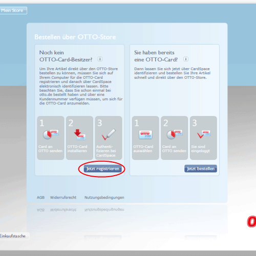
Blend is a program, codenamed “Sparkle” during its development, which belongs to the Microsoft Expression suite of tools. XAML is a markup language, which of course means you can edit it in a text editor, but if you want to work visually with XAML, you need Blend. During the development of the OTTO Store, we were working in partnership with Microsoft, so we had access to Blend from the early alpha phases on to today’s beta 2 version, which you can download and try out for yourself.

The idea behind Blend is one that it took some getting used to. You can draw shapes (all vector based) define colours, set type, whatever. But as you’re doing this, Blend is generating XAML in the background, i.e. Blend is a WYSIWYG XAML editor. You can also switch to a XAML view, and edit the markup directly. Most designers I’ve described this to have said, “oh yeah, I know that from Dreamweaver and GoLive.” Well, yes, sort of. The big difference is that with GoLive you’re only fiddling with HTML, which means you’re only defining structure for your texts and images, but you’re not creating the images themselves. In Blend you usually are, the exception being bitmaps, which you import from elsewhere. And in Blend, you’re producing layouts and graphics for an application, not a web page, which means when you’re done, your XAML will be compiled and displayed in a window like any other app. No Explorer, no Firefox, no plugins.

What Blend Isn’t

Although it may pain my colleagues at Microsoft to hear it, Blend isn’t in my opinion a design tool.

At it’s best, design is a process of playing around. The best design tools are still, and always will be, a pen and a nice sketchbook, because they’re so simple, so intuitive and so unlimited. When I’m designing something new, I need to be able to try out anything I want to, I make 20 micro-decisions every minute, and throw away 99% percent of everything I do. This is normal. The right-brain process of playing around, without any thought of how the product will be executed or what’s possible and what’s not, is what leads a designer to an excellent result.

Blend is a production tool. If I want to lay out something in Blend, I have to immediately make a number of technical decisions. For example, XAML has numerous different kinds of containers, which have different properties. So the first step in laying anything out in Blend is the question, “should I put this in a StackPanel or a Grid?” These kinds of questions are extremely left-brained, and pull the handbrake if you’re in a playing around right-brained phase.

First Right, Then Left

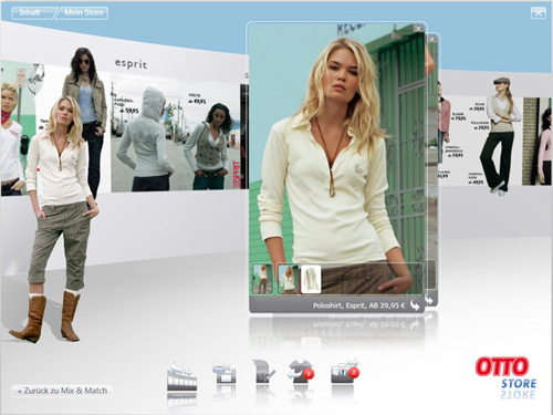
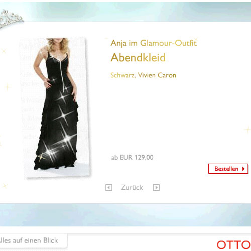
All of this was pretty quickly apparent to us at the beginning of the OTTO Store project. So, although Blend was supposed to bring the worlds of designers and developers together, and it was envisioned as the one tool for everything, we did, just as we do for web sites, design the basic look and key screens in Photoshop. These screens served as guidelines for the production designers (myself and Henrik Rinne) who were working in Blend. Once we had enough of the app in Blend, it became possible to make changes to the design details directly in Blend, and our Photoshop screens become less and less important. But I can’t imagine how we would have ever achieved the slick look of the Store without a right-brained phase in Photoshop.

The Right Tool for the Job

Even more importantly, it would have been impossible to conceive of and design the OTTO Store in Blend, simply because the tool defines its result. You won’t be cutting any wood with a hammer. If we’d worked in Blend from the start, we would have been so involved with what works and what doesn’t that we would have constantly limited our ideas, i.e. not played around enough. As it was, half of the ideas in the screens were met with blank developer/production designer stares and “um, I don’t think we can do that,” but in many cases we stuck to the idea, and worked out how to do it anyway. Unlike most applications, the OTTO Store was clearly defined as a style project from the start, so we had the rare situation of developers working towards a design and user experience vision, instead of designers attempting to create pretty window dressing for a pile of functionality. Judging by reactions to the Store, I’d say the difference is evident.

Originally published at mattbalara.com

Es geht nicht um Technik

„Ist das die Zukunft des Shoppings?“ Fragt Markus Breuer angesichts des OTTO Stores und trägt ein wichtiges Argument vor:

Was mich an der Zukunftsfähigkeit dieses Projekts zweifeln lässt, ist wirklich nicht der Neid. 🙂 Es ist die Tatsache, dass es sich um einen Online-Shop handelt,

  • der nur auf PCs mit Microsoft Vista (unter Aero) läuft
  • den ich downloaden muss, bevor ich ihn nutzen kann

Ich muss ganz ehrlich sagen, dass ich das für einen Rückschritt halte. Auch wenn Microsoft Vista in 2 – 4 Jahren vermutlich das meistverwendete Betriebssystem sein mag, ist es für Endanwender sicherlich nicht wirklich angenehm, für jeden Shop eine separate Applikation herunterladen zu müssen.

So ist es. Die Zukunft des Onlineshoppings sind nicht unbedingt proprietäre Clients, die nur auf einer einzigen Plattform laufen. Das erwartet vermutlich nicht einmal Microsoft.

Der OTTO Store zeigt, soviel ist richtig, die Möglichkeiten von Windows Vista. Das hat auch seine Berechtigung und ist das Anliegen von Microsoft. Aber viel spannender sind die neuen Möglichkeiten für einen kataloggetriebenen Versender wie OTTO.

Homevideo von shoppingzweinull.de

Es geht um Bedarfsweckung, Erlebnis und Entertainment (um mal Dr. Thomas Schnieders zu zitieren, Direktor Neue Medien bei OTTO). Es geht um neue Formen der Warenpräsentation und um Emotion. Und es geht um eine intelligente Verbindung von Katalog- und Onlinegeschäft.

Denn die Diktatur des besten Preises, unter der große Teile des E-Commerce-Geschäfts ächzen, gilt ja im Bereich Mode allenfalls teilweise – nämlich dort, wo Vergleichbarkeit herrscht. Geht es aber um die passende Hose zur Bluse, dann können guenstiger.de und Ebay nicht helfen.

Was die Technik angeht, so stehen wir hier vor dem klassischen Henne-Ei-Szenario. Second Life, um mal ein Lieblingsthema von Markus Breuer herauszugreifen, braucht auch einen (anfangs mehr, mittlerweile weniger proprietären) Client.

Ich hoffe, dass da ein noch paar Ideen mehr entwickelt werden und „Shopping“ im Internet auf Dauer mehr sein wird, als nur in einem Katalog zu blättern. Im Kern des „Shopping-Vergnügens“ in der physischen Realität stehen ja kollaborative, soziale Ansätze und die räumliche Nähe und inhaltliche Diversität vieler verschiedener Anbieter.

So ist es. Warten wir es ab. Ideen sind hier nicht die knappste Ressource. Soviel steht fest.

The Future of Shopping?

Today, Windows Vista appeared in, according to Bill, 39,000 stores. Quite possibly a big deal for many people who spend as much time in front of a computer as I do, but not for me, at least not when compared to the launch of the OTTO Store.

OTTO, for readers outside of Europe, is the no. 1 worldwide retailer in mail-order sales, and no. 2 behind Amazon in online sales. Maybe hard to believe, considering almost noone knows their name outside of Europe, but apparently it’s a fact. Americans have, however, certainly heard of Crate & Barrel, which is one of around 20 companies which belong to the the OTTO Group.

SinnerSchrader Studios, where I work, was lucky enough to be approached by OTTO and Microsoft, to develop a shopping application for OTTO which would run in Windows Vista. This became a challenging and exciting project for us which started last summer and culminated in the launch today. As of a few hours ago, you can download and install the OTTO Store (if you’ve already installed Vista, and have a good understanding of German).

OTTO Store

I’ve been designing stuff for the web since 1993. After working for so long in one medium (which to be honest hasn’t changed that much since then) it was a shock and in a way a relief to work on an app for Vista. It reminds me of the good old days of CD-Roms, when you could animate your heart out, throw in videos all over the place, and even spin things around in 3D if you wanted to. With Vista, and today’s growing bandwidth, that’s all possible again. It’s like a whole new world, and requires a whole new way of thinking. No more boxy layouts designed to make content management systems happy, no more pseudo piece of paper layouts, and no more browser. The OTTO Store is a self-contained application which is installed on the user’s machine. The fact that it’s a “download once, use many” experience gave us the freedom to think up stuff for which a user would never wait for his browser to show him.

As for the development process, “challenging” is a polite word for it. Since this was a joint project between us, OTTO and Microsoft, we had access to their development software (once known as Sparkle, now known as Blend, either way also known by the imminently forgettable name “Microsoft Expression Interactive Designer”) in the alpha and beta phases. This was obviously a blessing and a curse. Web designers are used to fully functional, stable programs like Adobe Photoshop. The security of knowing you can work all day and save when you go home is a feeling I learned to miss. On the other hand we spent a week in Redmond, got to give our feedback directly to Microsoftians, and were pleased to see most of our problems solved in successive versions.

The relief and pleasure of having the OTTO Store finished and online is noticeable throughout our whole team — all of whom I must add worked far more and harder on the Store than I did — but a big question mark remains in my head. Is this really the future of shopping? Noone can answer that question yet, but I’m very interested to see how many people download it, and of those, how many actually buy something. I’m honestly pleasantly surprised that a company as large and old as OTTO had the guts and vision to invest in something so innovative which may, at first, bring so little concrete return.

I’ve also got to say I’m proud and excited to be a member of one of very few teams who can realise such a project today in Germany. It’s been a long time since I’ve seen anything this new, worked in such a close-knit team, and learned so much at work.

More about the OTTO Store

Originally published at mattbalara.com.

Vorhang auf!

Der OTTO Store auf otto.de
Der größte Launch aller Zeiten war gestern. Jetzt kommt die spannendste Anwendung, die es für Windows Vista bis jetzt gibt.

Der OTTO-Store ist eines der Top-10-Strategieprojekte, mit denen zum Launch von Microsoft Windows Vista Anwendungsbeispiele demonstriert werden. Er wurde von OTTO in Zusammenarbeit mit den SinnerSchrader Studios realisiert, die als Kreativagentur auf den Bereich Digitale Medien spezialisiert sind.

Aus der Pressemitteilung der OTTO Group
Pressebild OTTO
Pressebild OTTO
Der OTTO Store hat es mit Windows Vista übrigens bis in die Tagesthemen geschafft (ab 2:40 Inzwischen ist der Vista-Beitrag nicht mehr online – auch ein bemerkenswerter Vorgang übrigens).
Tagesthemen vom 29.01.2007 im Windows Media Player
Besonders nett, wie Tom Buhrow fast den Moderationsgag versemmelt… public-beta.com schreibt:

OTTO hat es tatsächlich geschafft, den ganz dicken E-Commerce Knaller für 2007 auszulegen. Nach der Social Commerce Euphorie in 2006 schlagen die Großen jetzt mit schweren Geschützen zurück.

Und Chairman Bill William Henry Gates III, der immer noch aussieht wie gerade frisch von der Uni, war gestern bei Jon Stewart in der Daily Show:

Mehr zum OTTO Store bei ibusiness, bei Matt Balara, der am Projekt mitgearbeitet hat, und bei André Schuster, der gern am Projekt mitgearbeitet hätte.

Ottos Blog hopst

blog.otto.de

22. Juni 2006. Bilanzpressekonferenz von Otto. Michael Otto kündigt an: Otto investiert in das E-Shopping 2.0. Ein Bestandteil seines Plans: otto.de soll über alle Sortimentsbereiche hinweg mit interaktiven Kommunikationselementen aufgeladen werden.

Eines der ersten Beispiele war der OTTO Cinderella Contest. Und jetzt folgt – ein Blog! Wie das Cyberbloc von Cyberport24 ist es ein Gruppenblog, das zum Start (offizieller Launch am 28.11.) von Mitarbeitern befüllt wird, aber auch anderen Nutzern offensteht.

Das Thema: Geschenkideen. Nicht nur aus dem Katalog, das wäre zu einfach. Zunächst geht es als vorweihnachtliches Kampagnenblog an den Start, aber das Thema ist zeitlos. Ob es funktionieren wird? Wir werden sehen.

Eva bloggt übrigens auch mit. Nein, nicht die Eva mit den vielen Kommentaren und der monatlichen Blogfrequenz.

Stefan Wolk von Otto, der mich auf das Blog aufmerksam gemacht hat, schreibt seit kurzem auf shoppingzweinull.de über Social Commerce und, nomen est omen, Shopping 2.0.

Shopping Cinderella

Anja im Abendkleid

Über 1,5 Millionen Besucher kamen bis jetzt auf die Cinderella-Microsite von OTTO – keine ganz kleine Zahl. Mehr als 2.600 Frauen haben sich beim OTTO Cinderella Contest beworben, und seit heute stehen die zehn Finalistinnen zur Wahl – mit professionellem Styling und ebenso professionell ins Bild gesetzt, aber auch mit Vorher-Fotos zum Vergleich.

Und OTTO wäre nicht OTTO, käme hier nicht der E-Commerce-Ansatz ins Spiel. Denn natürlich kann der Rolli von Nadja aus Mandelbachtal oder das Abendkleid von Anja aus Göttingen auch gleich bestellt werden. Das hohe Nutzerinteresse dürfte hier sicher für die eine oder andere Bestellung sorgen. Nicht dumm.

Jetzt sind wieder die Nutzer gefragt. Bis Anfang Oktober können sie auf otto.de abstimmen und die OTTO Cinderella 2006 küren. Die Siegerin wird in einem Katalog der Frühjahrs-Saison 2007 abgebildet. Und Preise gibt es natürlich auch.

Die Kampagne stammt aus den SinnerSchrader Studios.

Cinderella gesucht

OTTO Cinderella Contest 2006
OTTO sucht Frauen, die zeigen wollen, was in ihnen steckt. Von heute an können sich auf otto.de die potentiellen Cinderellas bewerben. Eine fünfköpfige Jury sucht unter allen Bewerberinnen die 100 Besten aus, die sich ab 10. August auf otto.de zur Wahl stellen. Jeder kann dann abstimmen und mitbestimmen, wer die OTTO Cinderella 2006 wird. Am 30. August steht fest, wer es unter die Top Ten geschafft hat.

Die zehn Besten nehmen an einem professionellen Styling und Fotoshooting teil. Danach heißt es noch einmal hoffen und bangen, denn mit neuem Selbstbewusstsein und im perfekten Look stellen die Finalistinnen sich erneut den kritischen Usern. Wer hier die Nase vorn hat, wird zur OTTO Cinderella 2006 gekürt.

Die Siegerin wird professionell abgelichtet und in einem Katalog der Frühjahrs-Saison 2007 abgebildet. Außerdem gibt es natürlich Preise, auch für die, die mit abstimmen.
Die Idee und die gesamte Online-Realisierung der Kampagne inklusive Film-Trailer (Ton an! Der war teuer!) stammen aus den SinnerSchrader Studios.