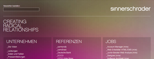
I’ve been designing websites professionally since 1995, and never has any site I’ve worked on been discussed as much as the new SinnerSchrader site, and, to be exact, it’s not even a site at all.
Let’s get the full disclosure out of the way first: I’m an Art Director at SinnerSchrader, and other than the occasional over the shoulder comment and discussion over a smoke, I had nothing to do with the idea, concept, or design of the new site. Go check out sinnerschrader.de, click around a little, and come back for my thoughts on it.
As you hopefully noticed, it’s just a link list. That’s it. All of our content is „out there“ in the web. Of course most of it always has been, and now our site is the place where all of the disparate elements — job offers, client sites, employee profiles, how to find us, etc. — meet. Instead of a perfectly polished and organised glossy brochure, which is what most agency websites are, ours is a knot which loosely joins our small pieces.
What’s Good?
I’ve loved the idea ever since one of my favourite coleagues, Ron (whose blog is still „coming soon“) told me about it. And, in so far as our site is just a list of links, I find it a logical and consequent execution of the idea. The web is not a book or a wall or a television, so a cover or a poster or a video is certainly in the medium, but not really of the medium.
As I explained in my Naked Relaunch article, I’m also a strong believer in the „it’s never finished“ mentality, when it comes to web design and content. The most exciting aspect of the web is that it’s continually changing, growing and becoming more and other than it is at this moment. Our new site doesn’t take this aspect far enough (more on that below) but the idea of a living collection of links that are easy and fast to add, change and remove is where I hope the site’s going.
Those are just two short and small „what’s goods,“ but for me they’re much more important than the more numerous „what’s not yet good“ comments listed below. I’m a fan of ideas, and, when compared with ideas, niggling details don’t weigh very heavily on my scales.
What’s Bad Not Yet Good?
Well, the first thing that makes my idea-focussed brain itch is: the thing’s static. Nothing’s happened since it went online on the 5th of December (be careful, there’s German behind that link). If the most exciting thing about the web is the continual change, then an agency website which says, „our stuff isn’t packed away in a shiny wrapper, it’s living out there in the chaos“ must have a site where something’s happening. For now it’s just a link list. There’s nothing new, nothing changes, it’s not alive.
The site is an idea, and it’s pretty brave, and I haven’t seen anything like it before, but we couldn’t stop ourselves from squeezing in at least a little wobbly, animated, flickering Flash. Maybe we were afraid it wouldn’t be „pretty“ enough for an agency site; I wasn’t involved in the decisions, so I don’t really know. Personally I think the Flash is decoration which doesn’t serve the goal or message of the page itself. Although I actually quite like wobbly pink, gold and grey aesthetically, I don’t think the page would suffer much if it wasn’t there. In fact, Flash is a shot in our own foot as far as search engines, the back button, auto-discovery of the rss feed, and copying text and links are concerned. These are as much the nature of the web as are links and distributed content, so why did we ignore these? I don’t know.
Other than all of that, there are a few little details which picky usability freaks have been pinning on us — e.g. the newsletter field should make it clear that it requires an email address — but I think the basic function (open external pages in a frame and close the frame again) works and is understandable. A few tweaks, and we’ll shake the bugs out. No big deal.
How Could it be Better?
Number one on my wishlist: let it live. Collect feeds from employee, spit in whatever turns up under the tag „sinnerschrader“ on Flickr, collect the Tweets of employees, friends and the company itself, mash it up and call it „The Secret Life of S2“ or „S2nd Life“, whatever. We’re a web company, we make web stuff, and more than a few of us live in the web, so why not show it?
We could get our hands a little dirtier with the clients. Just linking to their sites isn’t really enough, or sometimes it could be too much — a link suggests we did all of it. Sure, we design and program complete sites for many of our clients, but we also produce banners, single pages, micro-sites, etc. Why not — in addition to the links — simply throw up some screenshots at Flickr, a case study in the blog, whatever it is that best describes our work for that client?
Kick the Flash out. As far as I’m concerned kick the graphic typography out as well — with the exception of the logo and the claim, of course. The flashier it is, the harder it is to change, as well as the problems mentioned above. If the idea is links, make it 95% about links. Right now we’re around 70%.
Oh yeah, and let’s put in a search, as Martin „Nielsen“ Seibert suggested (Achtung! More German!), thereby proving that he didn’t even begin to understand the idea. But if you do, please link our search to Google.
How do you like our new site? If you were the boss, what would you add, remove or change? Let me know.
Originally published at mattbalara.com.
