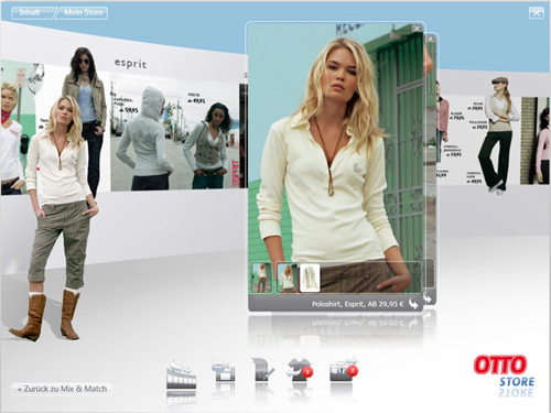
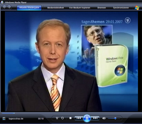
Today, Windows Vista appeared in, according to Bill, 39,000 stores. Quite possibly a big deal for many people who spend as much time in front of a computer as I do, but not for me, at least not when compared to the launch of the OTTO Store.
OTTO, for readers outside of Europe, is the no. 1 worldwide retailer in mail-order sales, and no. 2 behind Amazon in online sales. Maybe hard to believe, considering almost noone knows their name outside of Europe, but apparently it’s a fact. Americans have, however, certainly heard of Crate & Barrel, which is one of around 20 companies which belong to the the OTTO Group.
SinnerSchrader Studios, where I work, was lucky enough to be approached by OTTO and Microsoft, to develop a shopping application for OTTO which would run in Windows Vista. This became a challenging and exciting project for us which started last summer and culminated in the launch today. As of a few hours ago, you can download and install the OTTO Store (if you’ve already installed Vista, and have a good understanding of German).
I’ve been designing stuff for the web since 1993. After working for so long in one medium (which to be honest hasn’t changed that much since then) it was a shock and in a way a relief to work on an app for Vista. It reminds me of the good old days of CD-Roms, when you could animate your heart out, throw in videos all over the place, and even spin things around in 3D if you wanted to. With Vista, and today’s growing bandwidth, that’s all possible again. It’s like a whole new world, and requires a whole new way of thinking. No more boxy layouts designed to make content management systems happy, no more pseudo piece of paper layouts, and no more browser. The OTTO Store is a self-contained application which is installed on the user’s machine. The fact that it’s a “download once, use many” experience gave us the freedom to think up stuff for which a user would never wait for his browser to show him.
As for the development process, “challenging” is a polite word for it. Since this was a joint project between us, OTTO and Microsoft, we had access to their development software (once known as Sparkle, now known as Blend, either way also known by the imminently forgettable name “Microsoft Expression Interactive Designer”) in the alpha and beta phases. This was obviously a blessing and a curse. Web designers are used to fully functional, stable programs like Adobe Photoshop. The security of knowing you can work all day and save when you go home is a feeling I learned to miss. On the other hand we spent a week in Redmond, got to give our feedback directly to Microsoftians, and were pleased to see most of our problems solved in successive versions.
The relief and pleasure of having the OTTO Store finished and online is noticeable throughout our whole team — all of whom I must add worked far more and harder on the Store than I did — but a big question mark remains in my head. Is this really the future of shopping? Noone can answer that question yet, but I’m very interested to see how many people download it, and of those, how many actually buy something. I’m honestly pleasantly surprised that a company as large and old as OTTO had the guts and vision to invest in something so innovative which may, at first, bring so little concrete return.
I’ve also got to say I’m proud and excited to be a member of one of very few teams who can realise such a project today in Germany. It’s been a long time since I’ve seen anything this new, worked in such a close-knit team, and learned so much at work.
More about the OTTO Store
- A marketing video from OTTO — brace yourself for some stiff German English from the bosses at OTTO and my own boss Malte Blumenthal
- A very early version of the Store was included in See Windows Vista
Originally published at mattbalara.com.

